To celebrate the launch of Castle Invasion on Steam I’ve put together a showcase of how the game progressed from a very simple look (drawn by myself which was never a good idea) to a beautiful cartoony art style with much clearer design. My general design process is to get a functional system in place, identify it’s weaknesses and iterate until you feel like you’ve hit near perfection.
A Castle Invasion Waiting to Happen
Here’s how it all started at the end of 2014. A poorly drawn marshmallow of a man holding a bow much too big for his head. No enemies, nothing to hit, just a nice animation of him firing an arrow. This is the first and only build of Castle Invasion developed without Unity.
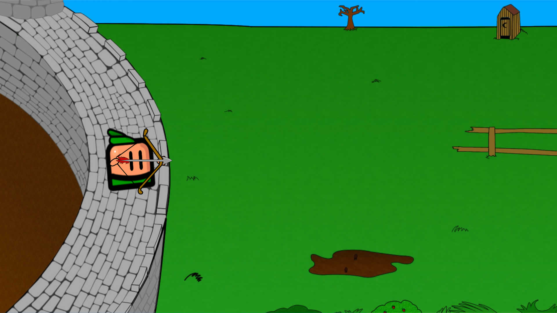
Look at the castle wall. I feel like that took me half of my life to fill in those stones. I could have built a real wall in that time. There’s also an outhouse near the top of the screen. Gotta provide a convenient place for invaders to relieve themselves. It’s only polite.
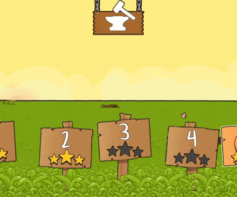
Level Select
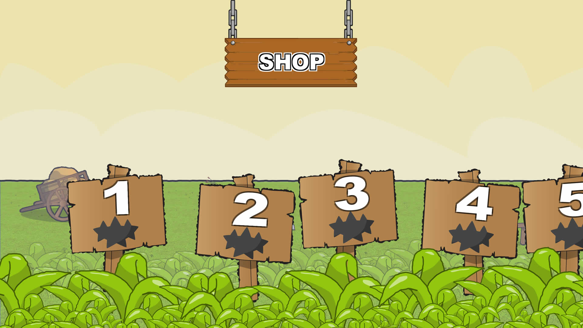
Fast forward 4 months from the build above and with a growing number of levels we needed a screen to select which one you wanted to play. Rather than go for a bland list we decided to have a nice horizontal scrolling screen with a sign post for each level. This is also the area where you would access the shop and buy upgrades.
The first pass had 3 static backgrounds that were shoved together with the numbers 1-10 overlaid on the sign posts. The font and the shop button leave a lot to be desired. The font is big and easily legible in the same way as a corporate powerpoint. It might impress your boss but not your average gamer.
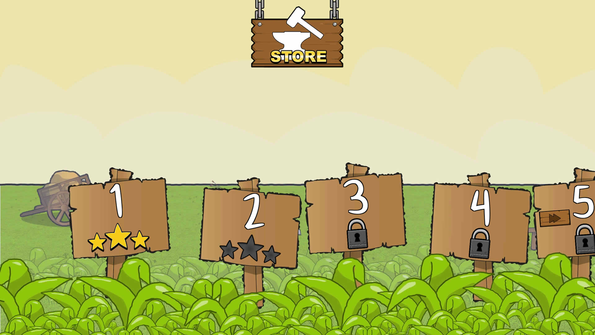
Zipping forward another 6 months. It’s all starting to look a little prettier. The stars are bright and obvious, there’s an icon in place for the shop button and the font is a little more happy go lucky.
And the final result. In static images it’s impossible to tell but lots has changed. Scrapping the static backgrounds of the previous builds we created a parallax scrolling effect for selecting levels. There’s two layers of grass, sign posts and the background all scrolling at different speeds. For a few extra brownie points in the visuals department the background colour changes dependant on what time of day the level occurs in. For night levels a moon appears in the sky and the background fades to dark blue. Lovely!
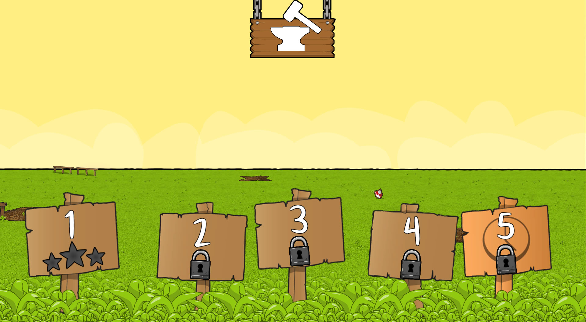
A gif to save the day and showcase that parallax action.
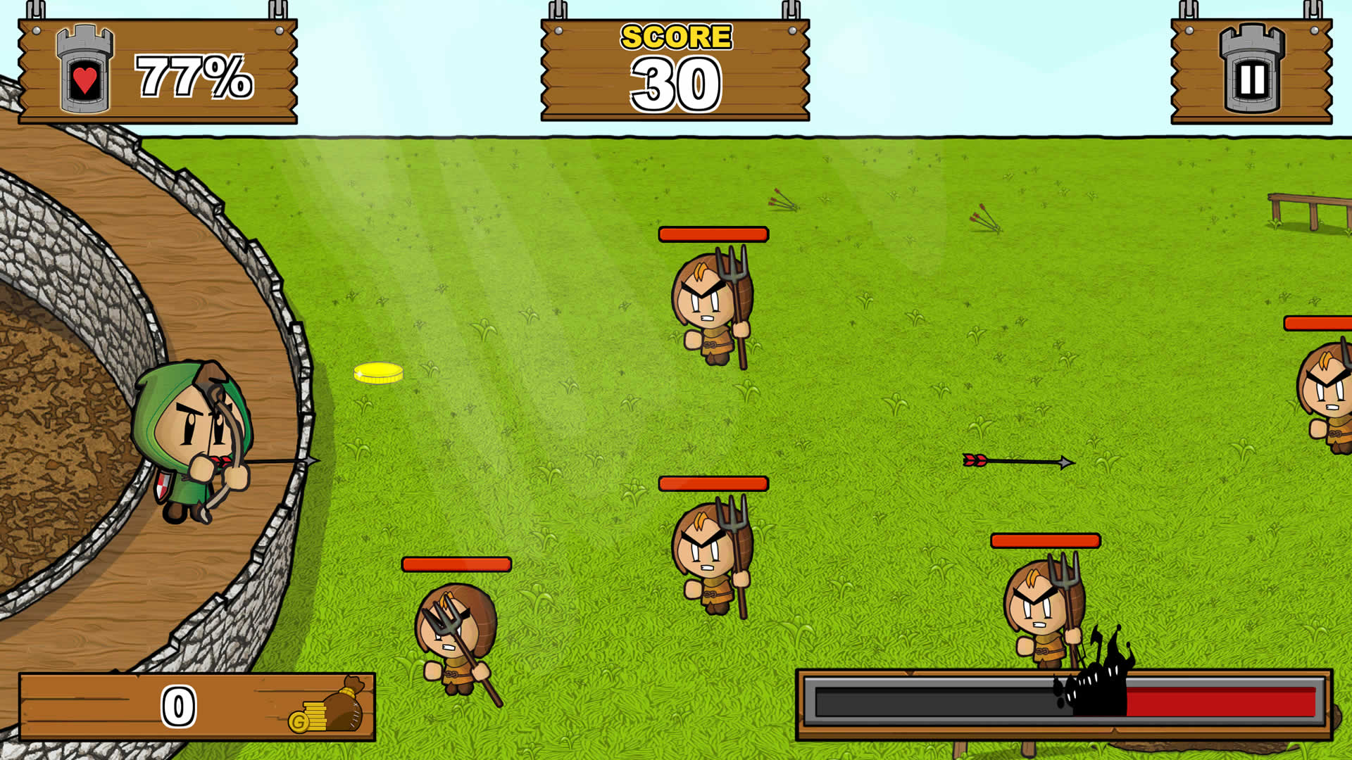
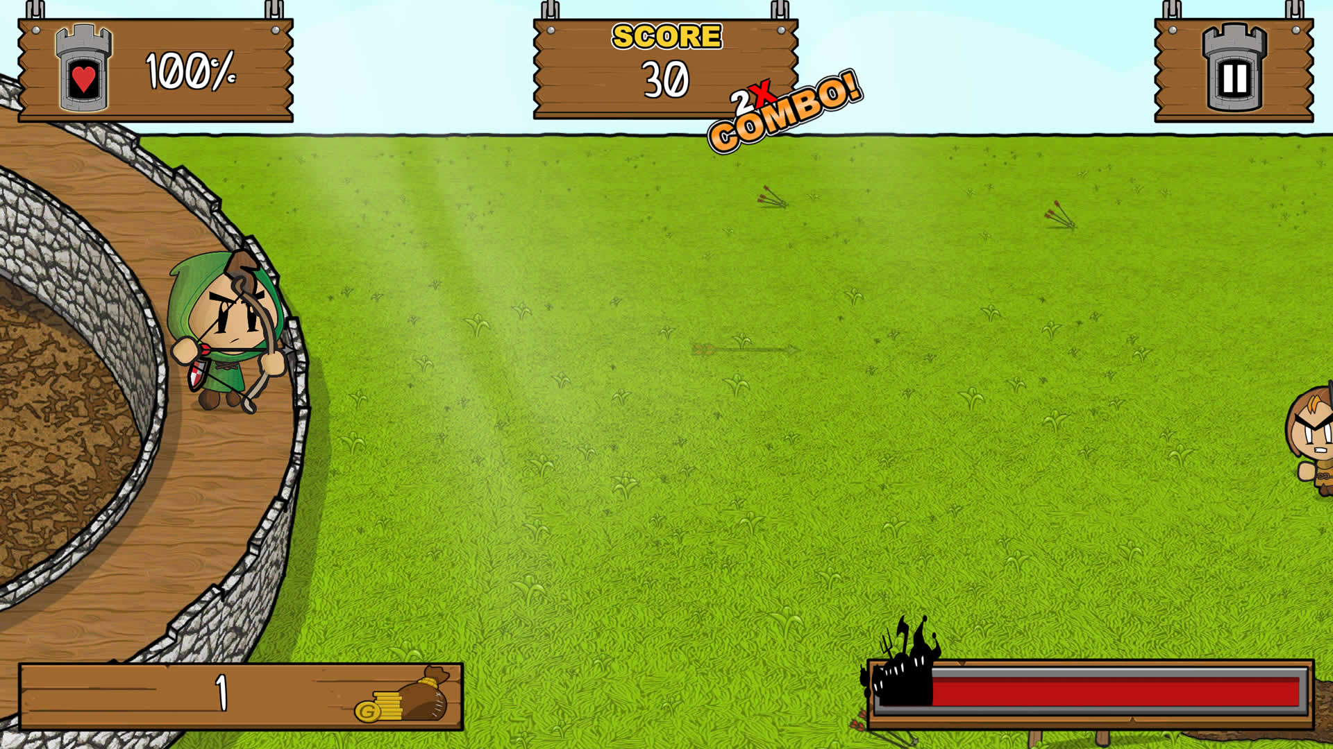
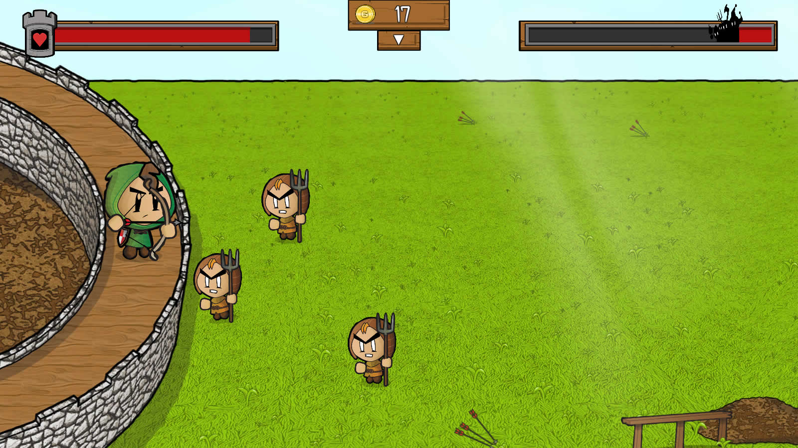
Gameplay
In the recent release of Castle Invasion there are 10 enemy types and 5 bosses. Plenty variety to create enemy combinations that keep you on your toes. The peasant was the first enemy type to be created. All adorable and angry with his little pitchfork. It’s would be an information overload to show you the progression of each enemy, instead I’ll focus on the in game UI. In the below two screens you have an abundance of information but very little you want to do with it. After minimising the information on screen and combining elements where possible the result is a tighter looking easier to interpret UI.
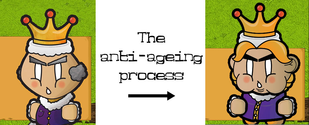
On a side note we redesigned the main antagonist of the game, the king. We were aiming for a spoilt, dislikable character. I don’t think we quite captured that the first time but nailed it the second.
Shop
Last but not least, the grumpy blacksmith and his grotty little shop. He trades weapon upgrades for gold. With a castle under siege it’s a bit of a mystery where he spends this gold but that’s not for us to judge. Similar to the main game the improvements come in clearly displaying all the necessary information. One of the surprising time consumers on the art side was the shop icons. We have over 40 upgrades to buy in the shop with most of these upgrades having their own unique icon.
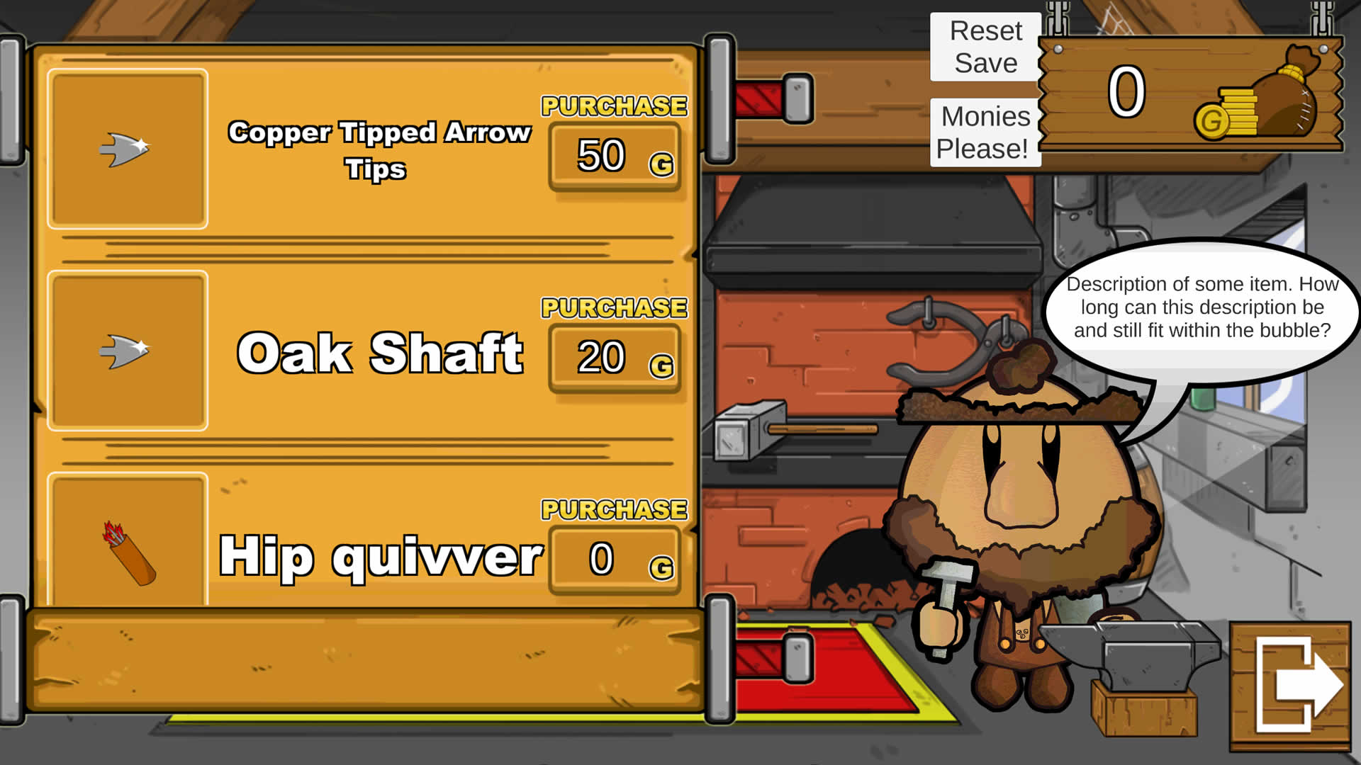
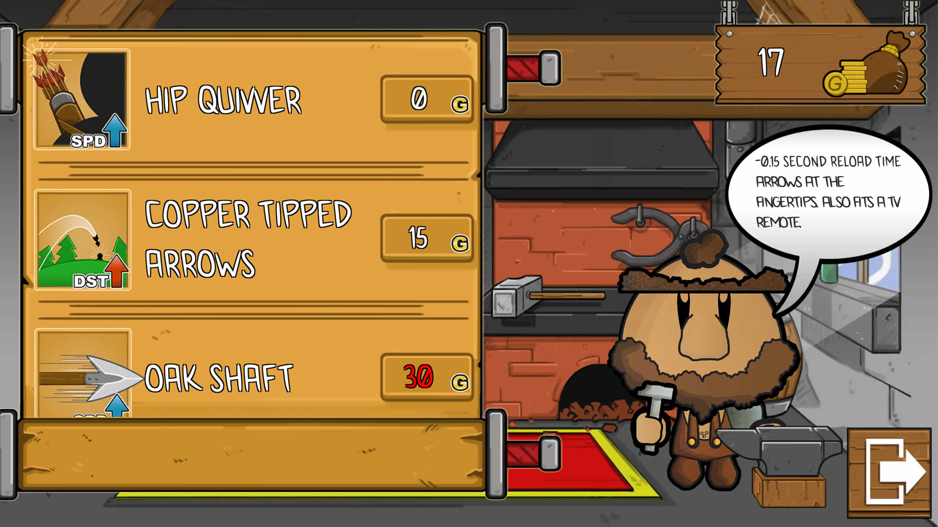
Subtlety and clarity was the result. The shouty outline of each upgrade has disappeared whilst still being perfectly legible. The coin counter has made it’s way to the centre to make it more prominent. Throughout development one of the pieces of feedback we kept receiving was that players didn’t always know what each upgrade did. The information was there but it was buried a little, the player would have to click an upgrade and read a wall of text from the blacksmith. We simplified that by showing what was affected just underneath the name of an upgrade and providing a bar that fills as you upgrade that effect. With such a beautiful shop you’ll want to remortgage your castle to buy more.

I hope your enjoyed that little tour through the design of Castle Invasion. If you want to get stuck in to playing head over to Steam for more fun and frolics.
See ya!

Comments
There are no comments yet. Be the first!